Eleventh Hour Project to Create Branding Identity for Simon Cowell's Globally Televised Talent Search.

THE CLIENT:
FremantleMedia | Syco Entertainment | Saban Brands | Univision Networks
THE BRIEF
• We were asked to complete a last-minute overhaul of the branding when the original firm tapped for this project dropped the ball.
• The client is a world-renowned creator and distributor of some of the most compelling television entertainment including shows like 'American Idol' so the bar was set very high.
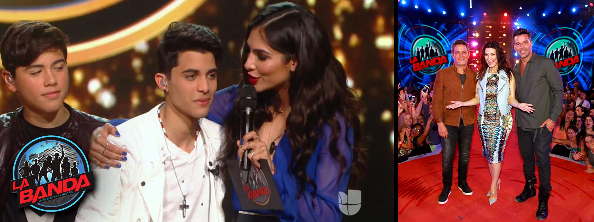
• A Spanish-language singing competition series created by Ricky Martin and Simon Cowell, La Banda aired on Univision.
• Create a brand aesthetic that would appeal to a young international audience and could be customized and sold to different markets. Researching for a new generation of viewership on Univision, they were looking for something bold and audacious.
• 'La Banda' means 'The Band' because of its generic name, the clients needed a logo that would encompass more of what the show was about.
THE INSPIRATION
We wanted to create something lively - that encapsulated the excitement and anticipation, the unfolding journey to find the next generation of superstars.
The opening sequence begins with an image of the earth with a distinct focus on Central and South America. This quickly morphs into a pulsating speaker that communicates the vibrancy and energy of the music. Bright lights of superstardom give way to a futuristic cityscape. The lights of this energetic metropolis mimic the circuitry and technology connecting people around the world.
The impact of the music reverberates throughout the city and as the scene pans out you can see that it quickly spreads from the show's home base of South Florida and around the world until the image of the band appears - a mystery group that will eventually be chosen and elevate its members to unimagined fame.
THE DELIVERY
• Under time-constraints, due to another company's unsuccessful attempt at this project, we were able to deliver a well-received brand identity that kept the television production on schedule.
• Early on, we realized how critical it would be to find a way to allow all three involved production companies have their say. An approval flow was developed to make this possible.
• The 'La Banda' logo was the keystone to this project and was the first design aspect that was perfected. Multiple iterations were created, and the feedback provided eventually helped us to arrive at the final choice.
• Once the look of the logo was approved, we were able to generate the accompanying design elements that would be necessary for entire production. Our team created on-air graphics, print material, stage graphics- all the branding needed to produce a show.
LOGO DEVELOPMENT